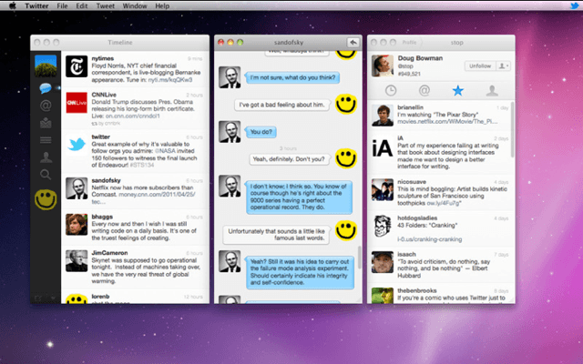
Shortly after announcing big changes to its web application, Twitter has pushed out an update to its free application for the Mac. Version 2.1 boasts an improved user interface and new features that make the application a whole lot nicer.
The application now follow’s Apple’s user interface guidelines a little more closely and improves upon some of the things that have were previously mocked when the app was first released, such as the lack of a native toolbar.
It now offers the ability to clone windows, so you can have a different one open for your timeline, your mentions, and your direct messages; and keep track of different things all at once.
The full list of changes and improvements includes:
- Multi-window support
- Username and hashtag autocomplete
- New window design
- New message conversation design
- Improves display of t.co links
- Font size preferences
- AppleScript support
- Sticky Live Stream preferences
- Developer console
- Performance improvements, enhancements and bug fixes
I must say that I wasn’t a massive fan of Twitter for Mac before the 2.1 update, and I suppose that was largely due to its UI. However, I’ve been playing around with the latest version and I must say it’s a vast improvement. I just wish they’d drop that horrible 3D icon.
Grab it now from the Mac App Store.


