The Apple Watch’s tiny screen has already proven to be a boundless landscape for creatively organizing app icons, but one obsessive reddit user has created the most scientifically convenient app layout we’ve seen yet.
A redditor posted his “best app layout” explanation for the Apple Watch today.
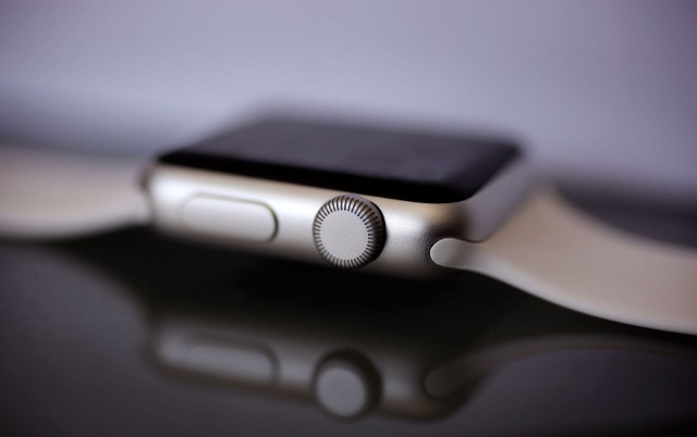
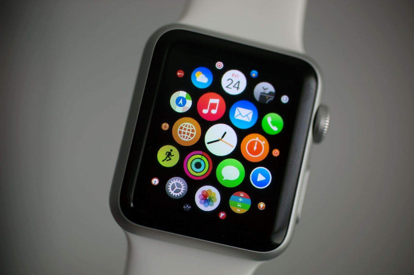
Photo: Jim Merithew/Cult of Mac
It’s based on Fitts’s law, a scientific model of human behavior that basically says, “Time spent is relative to the size of the target and the distance you have to travel to get there.”
For applying Fitts’s law to the Apple Watch, the redditor thought about how difficult it was to tap the app icons on the wearable’s tiny screen.
“I don’t have fat fingers, but I found myself tapping the wrong app constantly,” he said. “I was being mindful, too, and still was hitting the app adjacent at least one out of every five taps.”
He came up with the idea that “the best way to shorten interaction time on the app screen is give yourself more space for error.” The less of a chance there was for accidentally tapping another app, the better.
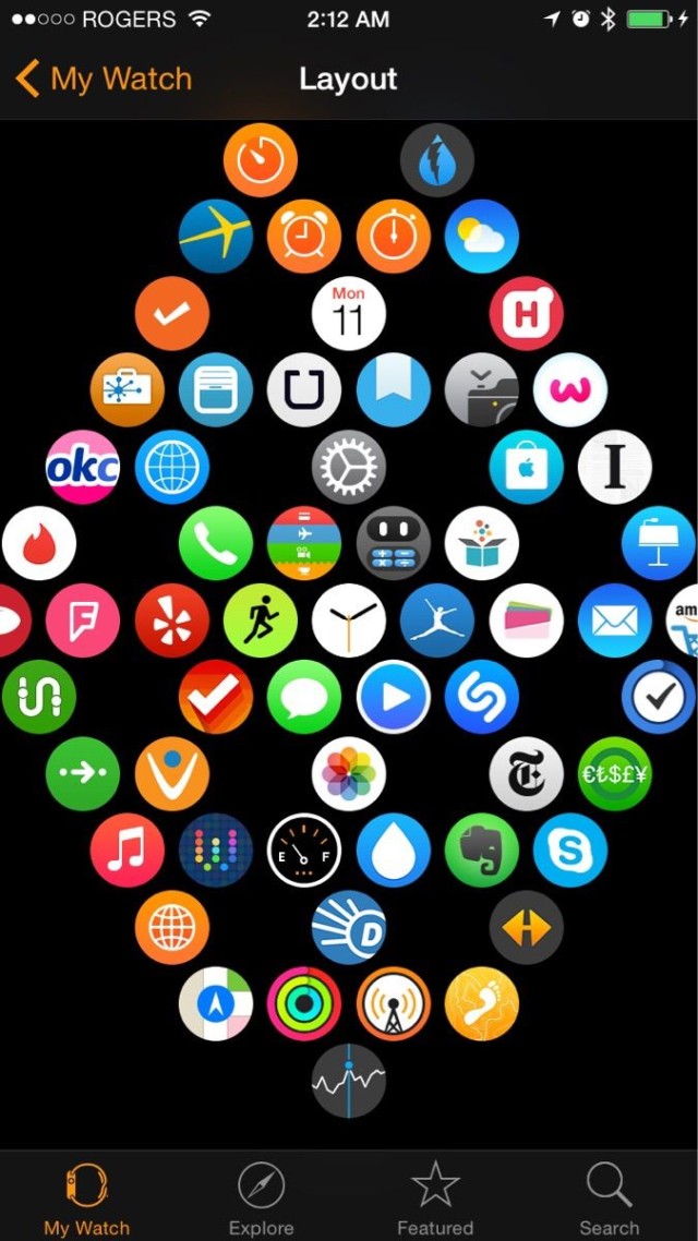
So he turned his home screen into a series of circles. Six apps form a circle with an empty space inside it.
The circle approach makes getting to apps a lot quicker than forming a giant line of icons or some other weird shape.
Another plus is that you’ll significantly cut back on the risk of tapping the wrong icon by mistake. “Once you get used to aiming for the app you want but on the side that’s facing the space, you’ll pretty much eliminate most accidental taps,” he said.
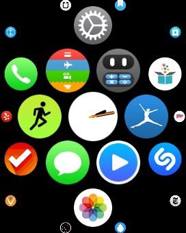
Start with the Watch icon dead center and build circles going out diagonally. The first circle contains your most-used apps.
Building out horizontally could work, too, but he found that diagonally felt more natural to his finger. The Digital Crown helps you zoom in and out on circles if need be.
It’s a pretty smart layout for saving time on small interactions.
It’s helpful to organize your apps “partly by the category they belong in and partly by the frequency of use.” The more an app is used, the closer it is to the center circle with the Watch’s icon. You could cluster around ideas or categories of apps, like travel or productivity.
If an app has a Glance you’re using, you won’t have to manually find its icon very often. So leave it in an outside circle and forget about it.
For the redditor who came up with this theory, saving time on completing actions is what the Watch is all about.
“The thing people say the most when they know you got a watch is that ‘you can do all of it on the iPhone.’ It’s, of course, true. But the reason I got the Apple Watch is Fitts’s law. Each ten seconds you’re saving per day per app is an hour saved a year.”
