We’ve seen a bunch of “OS X meets iOS” concepts for the Mac over the last few years, most of which have been pretty meh, but this recent submission to us is the first one I wouldn’t mind using if OS X 11 absolutely has to take all of its design cues from iOS 7.
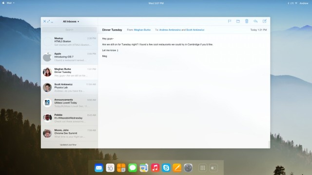
Created by Andrew Ambrosino, the OS X 11 concept is dripping in translucent blurs with flatness and minimalism spread all over. I really like the transparent menu bar with the expandable menu, though I’m not a fan of forcing OS X app icons to be rounded squares just like in iOS.
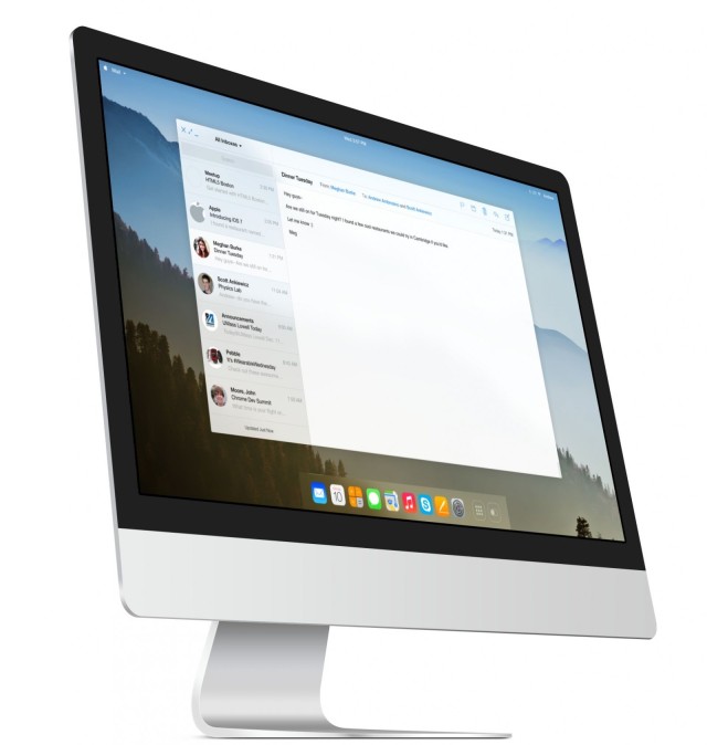
Take a look at what the Mail app could look like if given the iOS 7 treatment:
The open white interface of the update mail app would be a nice upgrade over the heavy grays Apple currently uses. Apps will probably gain more translucency as Jony’s designs progress, but do you think Apple will ditch the classic red, yellow, and green window buttons?
Not sure what the toggle switch in the dock is for under in this concept, unless it’s the magical lever that sends my trash hurtling to a fiery digital furnace.
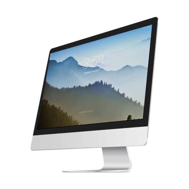
OS X Mavericks still greets users with a login box as soon as you wake your Mac up, whereas iOS doesn’t prompt you for your PIN until you try to interact with the device. It looks like Andrew’s concept fixes that difference with a beautiful minimalist login screen with the time and date featured front and center before you log in.
Source: Andrew Ambrosino
![What OS X Could Look Like If It Gets Jony’s iOS 7 Treatment [Concept] OSX11concept1](https://www.cultofmac.com/wp-content/uploads/2013/12/OSX11concept1.jpg)
