Over the past few months, I have installed the iOS 7 beta on a lot of devices. Maddeningly, every time, I have had to reset my app layouts manually, dragging apps into folders and onto my preferred home screens, app by app.
If you’re dealing with a large number of apps — oh, say, 64 gigabytes worth, as I am — the best way to do this is through iTunes, but even in iTunes, the app organizer leaves a lot to be desired. But iTunes 11.1, shipping with OS X Mavericks, is going to change that a little bit.
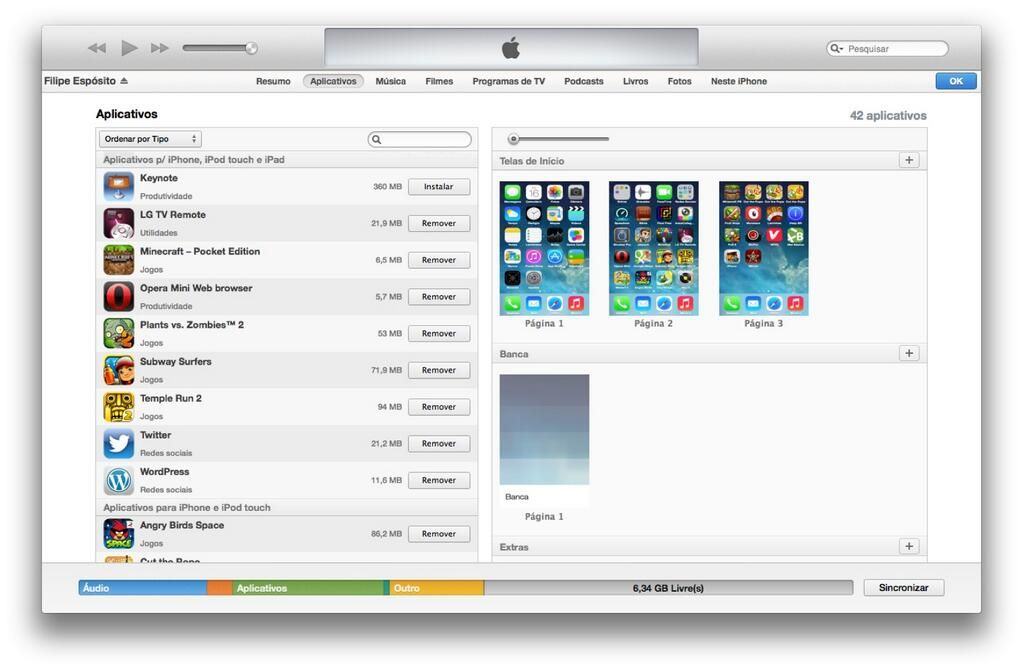
Last night, Apple seeded the Developer Preview 8 of OS X 10.9 Mavericks, shipping with a new version of iTunes that features this brand new app screen organizer.
Previously, the app screen organizer in iTunes was completely vertical, and all of your homescreens were in a long row that had to be scrolled through. Worse, you could only see one home screen at a time. That made it difficult to move, say, a number of app icons from the 9th home screen to the first, or vice versa.
The difference in iTunes 11.1 is that home screens are now laid out side-by-side, making it easier to shift apps. It’s a small change, but a welcome one, although I still think Apple could do a lot better: for example, allowing us to select more than one app to move at once, by dragging a box around them or by option-clicking. But this will do for now.
Source: Filipe Esposito
Via: TUAW


