In just the last fifteen years, a lot has changed for Apple. The company has transformed itself from a dying corporation teetering on the brink of bankruptcy into the most powerful technology company in the world, a giant that has revolutionized pretty much every aspect of technology.
Given the extraordinary changes that have happened to Apple in the last fifteen years, you’d think that the Apple.com homepage would have gone through a lot of changes too. But it hasn’t. Why not?
Going back through fifteen years of Apple.com homepages, it is clear that for Apple, their website is just another product, just like an iPhone or iPod. When Apple wants to make a new product, they first find the ideal form they think that object should be, and then endlessly iterate upon it over successive generations to bring the function of that form into sharper relief.
Apple’s website is no different. Here’s how Apple has refined it over the years.
Before The Revolution: Apple.com From 1996-1998
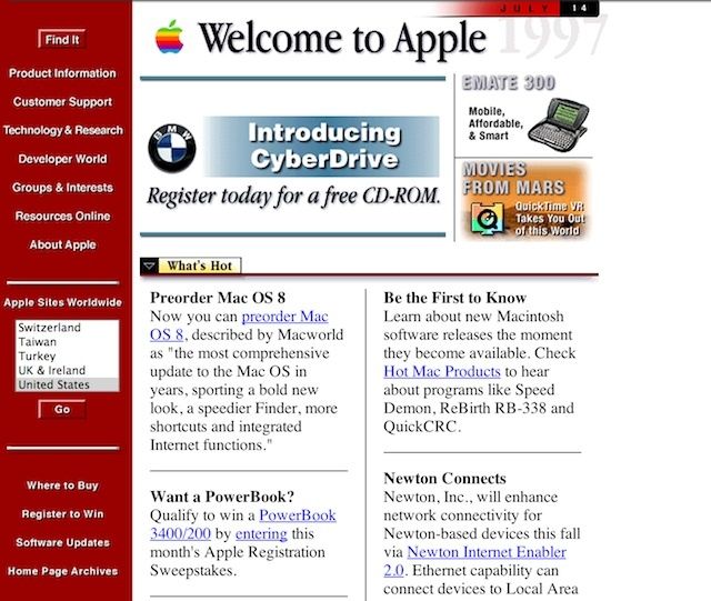
Back in 1996, the Apple.com website probably looked decent compared to other websites in the mid-90s. It followed the standard design trends of the era, with a format that looked more like a fancy e-mail newsletter than a website. There’s a sidebar of information and a few blocks designated for stories that were aimed at educating people about Macs.
Putting The “i” In Mac: The 1998 Redesign
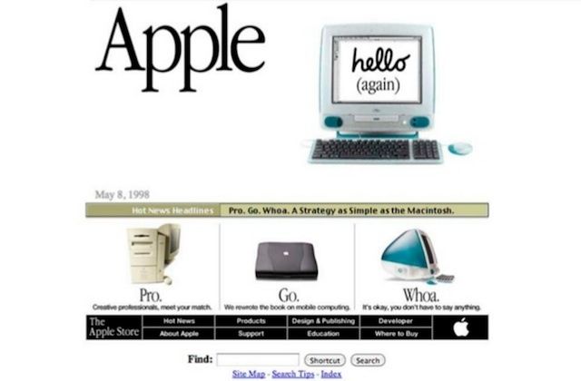
When Steve Jobs unveiled the iMac in 1998, Apple.com also got a facelift. It needed one.
The “i” in iMac stood for Internet, and Apple.com needed to look like it was created by a company that was pushing forward the boundaries on the very frontiers of the web. To do that, Apple needed to start treating its homepage not just like a repository of basic information about their company, but like something they were actually selling: a product so important that they had slapped it in the name of every “Internet Mac” sold.
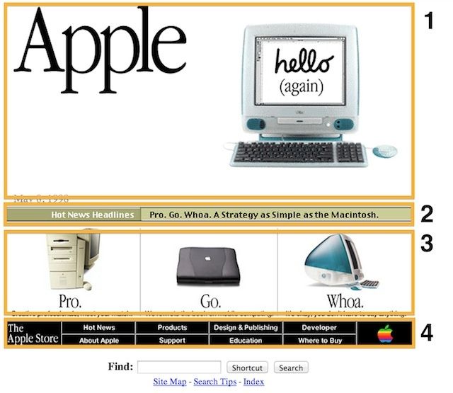
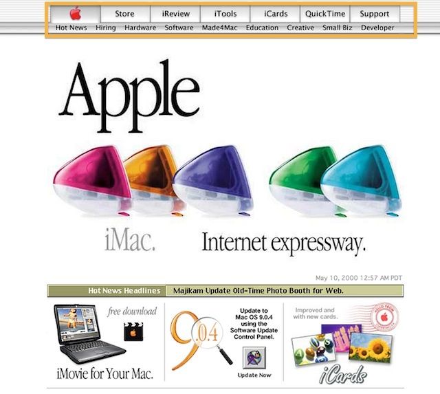
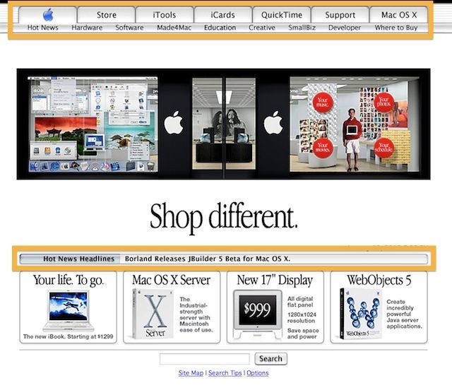
The 1998 Apple.com redesign was incredibly important, because it was a redesign that would see the basic shape and structure of Apple’s homepage take hold, to be honed and refined but never substantially altered over the course of the next 15 years. The newest iMacs can trace their design lineage back to the original iMac of 1998, and we can trace the main elements of Apple.com back to the 1998 redesign.
Every Single Line Means Something: The Apple.com Formula
With every new product Apple creates, they find a basic form that they think perfectly encapsulates the function of a product and then continue to refine it over the years to reduce that form to its essence. The iPhone, iPad, iMac, and MacBook have all retained the essential form of the first generation model, but Apple has perfected each one by adding new features, introducing new technology and manufacturing processes, and stripping away superfluous elements.
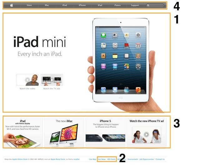
Apple.com has been no different. In 1998, the Apple.com website relaunched with four main components that are still in use today.
- The Big Box – As largest section on Apple.com, the main product section is used to promote newly launched products and give them the bulk of visual space on the homepage.
- Hot News – Rather than displaying news all over the front page, the 1998 redesign featured a small news feed area that didn’t detract from the focus of the page: Apple’s newest products.
- Small Promotion Boxes – Used to promote smaller products in the Apple lineup.
- Navigation Bars
Over the years, Apple has slowly refined these elements, bringing their website’s function into sharper relief.
Consider the following evolution:
![Back To The Future: 15 Years Of Apple Web Design Seen Through A Time Machine [Feature] backtothefutureiphone](https://www.cultofmac.com/wp-content/uploads/2013/01/backtothefutureiphone.jpg)
