Apple’s Maps app is a bomb. A stinker. A sign of the company’s impending doom at the hands of Tim Cook, the CEO who replaced the irreplaceable Steve Jobs.
Landmarks are in the wrong place. Roads are missing. The 3D Flyover view looks like a collapsed sponge cake. There are no directions for buses, bikes or pedestrians. Entire cities are marked as hospitals, the Golden Gate Bridge is in the wrong place, and even Apple’s own retail stores can’t be found. It’s such an embarrasment, Tim Cook apologized for its suckiness.
But if you live in San Francisco, the Maps app rocks. I’ve been using Maps for weeks and I’ve fallen in love with it. I use it even if I’m *not* using it, just to watch the gorgeous 3D display unfold as I’m driving around.
Apple’s Maps app is by far the best maps sofware around. Tim Cook is a wussy. You’d love Maps too — if you lived in a geography where it works.
I know there’s a lot of places Maps doesn’t work. New England for example. It’s unusable around Boston, according to our own John Brownlee, Cult of Mac’s deputy editor.
But here in Bay Area, it’s absolutely awesome.
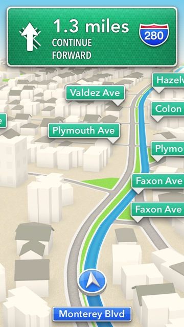
The 3D turn-by-turn directions, for example, are a joy. It’s a blast to watch the 3D vector renderings of the city as I drive around. I have my iPhone 5 mounted just below the windshield. It’s totally Blade Runner to watch the virtual city on the iPhone mirror the real city in front of me.
In addition, turn-by-turn is great on the iPhone 5 in portrait mode. Aligned vertically, the new iPhone’s longer screen is perfect for turn-by-turn. You can see what’s coming well in advance. No more surprise turns or last-minute freeway exits.
The performance is phenomenal. Because Maps is vector based, maps are much quicker to download and draw than Google’s tile-based approach. I’ve frequently been frustrated by missing tiles in Google Maps, or having to wait forever to get enough data to zoom in or out. This doesn’t happen in Apple’s Maps. Zooming and panning is quick and fluid.
There have been lots of complaints about the paucity of points of interest. But in SF, there are all the restaurants, bars, coffee shops, museums and gas stations you could possibly want. Even my neighbor’s obscure little auto upholstery businesses, which he runs out his garage, is listed.
3D Flyover
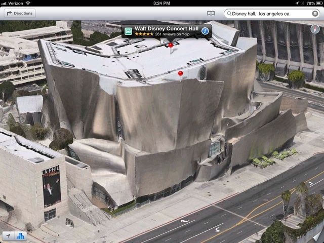
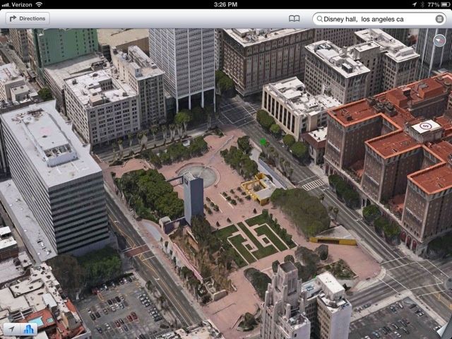
The 3D Flyover is nothing short of astonishing. I’ve spent hours — literally hours — exploring my home city, as well as London, Los Angeles and New York in glorious photo-realistic 3D.
3D flyover allows you rotate, pan and zoom through the city as if it was modeled on a high-powered workstation, not your iPhone. It uses footage taken by airplanes flying over the city, run through technology originally developed for missile-guidance systems from Swedish defense contractor Saab AB. The result is a weird blend of computer model and birds-eye photography — and it must be seen to be believed.
Here’s a video explaining how the 3D flyover views are obtained:
https://youtu.be/CNemPTHOKWg
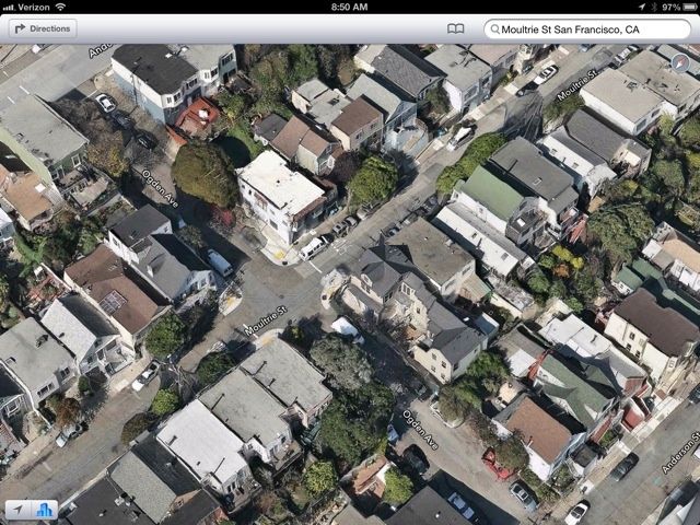
It’s crazy how much detail the technology captures. My neighborhood is picture perfect in every detail and from every angle, including directly above. You can peer right into my back yard, which can’t be seen from the street, and my neighbor’s too. It’s almost an invasion of privacy.
Here’s a shot of where I live: San Francisco’s Bernal Heights neighborhood.
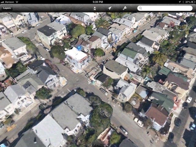
Here’s the same view in Google Earth, which I used to think was pretty extraordinary. But it looks hopelessly primitive in comparison. Buildings are lumpy and ill-defined; and there’s nothing like the same level of detail. In Apple’s Flyover, I can see the pipework on the back of our house. In Google Earth, the house is a squidgy blob.
Flyover is a digital dollhouse on the scale of an entire city. It’s mind-boggling. The dollhouse effect in accentuated by the complete absence of people in the flyovers. Whereas Google Maps’ Street View shows people with their faces blurred, there’s not a soul in Apple’s flyovers. It’s like the Rapture. However, there are ghosts of people and vehicles, which suggests that Flyover edits out moving objects. People move, the buildings don’t.
I don’t think Tim Cook has anything to apologize for, especially when you compare Apple’s Maps to the alternatives. Cook recommend unhappy users check out Mapquest or Waze while Apple gets it act together. Waze is solid, but its interface is horrible. It’s ugly to the point of unusable. In Mapquest, search doesn’t work. Look for “Chase Field” and you get banks or businesses with “Chase” or “Field” in the name, but not Phoenix’s downtown ballpark. This doesn’t happen with Google Maps or Apple’s Maps. It just works.
Google Maps is the gold standard, but I’ve always had problems with the actual directions it provides. I’ve often been mystified by some of the routes Google Maps suggests. Several times it’s been flat out wrong. Not so with Apple Maps. The routes are rational.
Of course, I used Google Maps for years and I’ve only been using Apple Maps for a few weeks, but so far, the routes it suggests make sense. It also does a good job of providing alternative routes. The big hole is routing for pedestrians, bikes and public transit. These work well in Google’s Maps. But it’s early days yet for Apple’s Maps. Let’s hope they get added in the future.
And then there’s aesthetics. Apple’s Maps is just gorgeous. The colors, the textures, the fonts. I’m not much of a design snob, but Maps brings it out in me. I can barely look at Google Maps anymore. I used to like its bare utilty, but now it’s just ugly.
All in all I’ve really fallen for Apple’s Maps. I love it. I wish it worked just as well where you live.
![In Defense of Apple’s Awesome Maps App [Opinion] Apple_Maps_2](https://www.cultofmac.com/wp-content/uploads/2012/10/Apple_Maps_2.jpg)
