The old one lasted a quarter of a century, but Microsoft has now unveiled a new logo ahead of the anticipated launch of Windows 8, the most radical revision of the world’s most popular desktop operating system to date. It’s boring, but in regards to embracing the minimalism of today’s design trends with a soft, non-stylized font, it does a good job.
This is a logo that will, as Forbes‘ Adrian Kingsley-Hughes notes, look great on Microsoft’s upcoming accessories.
It also does a pretty good job of standardizing the “look” of Microsoft’s products, from Windows to Office to Xbox to the company itself.
https://youtu.be/OzkZWvAJUr0
Explaining the decision to switch to a new logo, Microsoft’s Jeffrey Meisner writes at the official Microsoft Blog:
The logo has two components: the logotype and the symbol. For the logotype, we are using the Segoe font which is the same font we use in our products as well as our marketing communications. The symbol is important in a world of digital motion (as demonstrated in the video above.) The symbol’s squares of color are intended to express the company’s diverse portfolio of products.
What do you think? I certainly prefer it to the last logo:
But not this incredible spirograph 70s logo:
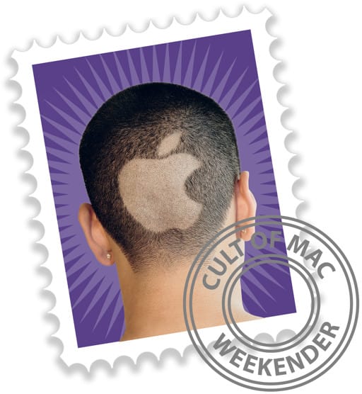
And of course, it’s telling that after almost forty years in the software game, Microsoft still needs to spell out their name in their logo, while Apple has been able to get away with one iconic symbol for decades:
Now that’s a logo.
