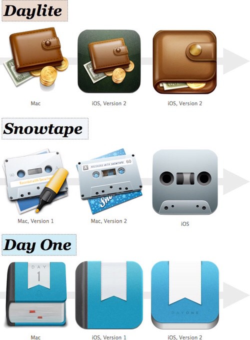
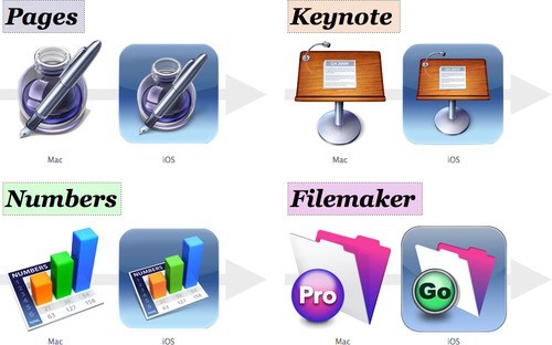
Or not. In an exhaustive (and for him, probably exhausting) 2,700-word article, Chris Suave has compared the icons of many apps that have moved from OS X to iOS (and sometimes back again). The results show that Apple is one of the worst and laziest offenders in the game.
Exhibit A: iWork:
These applications took the existing Mac icons, slid them into a rounded square and painted on a background color. It looks as though [Apple] spent five minutes selecting a gradient for the background of the iOS iWork and Filemaker icons and called it a day
It's not all bad, though. Among the offenders (same icon, but with the corners rounded; round icon, turned square; all iTunes icons, ever) there are some gems. And some of them aren't even blue!

There are even a few developers (like Omni Group) whose icons were so good they were ported back to the Mac after a slight tweak.
The best, though, are the icons designed to keep the spirit of the original, but pared down to match the simpler approach of iOS in general. As Suave says:
The much more interesting icons are those that have focused their design on communicating more clearly by getting rid of, or greatly reducing the visibility of, non-key details.
I'm something of an icon snob. I really do pick apps based on these little square representations, although I'll admit that I have bought apps with great icons, and those apps turned out to be terrible. And don't even get me started on the iPhoto for iOS icon.
Source: pxldot


