Few people, other than Michael Scott on “The Office,” like Applebee’s. Recognizing this, the company just redid its logo, and, well, it kind of looks like Apple’s logo.
Applebee’s Old Logo:
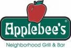
Applebee’s New Logo:
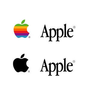
Apple’s logo. The main similarity I see is in the font. A bit too close for comfort. Thoughts, Apple legal?
Applebee’s images via BrandCurve.
Apple logo courtesy Pycomall
60 responses to “Applebee’s New Logo Close to Apple’s Logo”
Slow news day?
What sort of a hall-monitor, favour-currying, stool pigeon post is this? Intellectual property laws are already draconian enough — we don’t need people like you walking around trying to engage them against people and things you disfavour like some neighbourhood informant in the Nazi negime. Why don’t you just let Apple handle their own legal affairs? They are perfectly capable. Find something else to do.
The apple’s leaf looks similar. The font is the same as in they both use the latin alphabet. This is a truly lame story. DBL is spot-on.
I don’t see it. Especially regarding the fonts — completely different.
I’d like to preface this by noting that I’m a professional graphic designer:
You can’t be serious.
I think this isn’t surprising at all. Apple’s logo has influenced how corporate logo’s are deigned, and applebee’s was already close so… well, what else could happen?
well…. as long as they don’t put ‘eat different’
well…. as long as they don’t put ‘eat different’
From a legal point of view: totally legit.
Different industry, different look and feel. Looking at Applebee’s and Apples logo would you be confused as to which is which? I wouldn’t think so.
From my perspective as a designer they’re totally different. Apples is polished and cleanly executed. Applebee’s: not.
My 2c.
pahahahahahahahaha, eat different! hahahahaha, thanks, I enjoyed that!
Those two fonts are absolutely nothing alike and if you think they are you have no concept of font design. Look at the lower case L, the A, the angled e, nothing alike. Stop being such a fanboi and creating trouble.
Michael Scott likes Chili’s, not Applebee’s. Chili’s is the new golfcourse – Small Business Man Magazine.
I wouldn’t normally result to name calling, but the more I read from you the more I’m convinced that you’re an idiot. Cult of Mac used to be an interesting read, you’ve really brought it down a few notches.
Not a bad observation; true, the sign is more minimalistic and the apple more closely resembles the ‘new’ apple logo (if you looked at the silhouettes of both), but frankly, can anyone copywrite an apple? Personally, I think the new applebee’s sign is sufficiently different in both the physical form of the logo/text and in the way the new logo comes across to a person viewing it.
I think you’re seeing things that I don’t see. The new apple, while stylized, looks more realistic than the Apple Inc logo. I really like the highlight. I’ll give you the leaf, but that’s nothing original from Apple, either. The Apple logo is a stereotyped caricature, less realistic, and two-dimensional. As for the logotype, the only thing they have in common is being serif fonts. The Appleby’s A is very styled, the p’s have open loops, and e’s are canted up. On top of that, the serifs are flat, while Apple’s are angled. Finally, the dimensions of the Appleby letters are much closer to square than Apple. I’m kind of surprised you came to your conclusion.
The fonts are not even close. Both serif, but nothing else. Look for news somewhere else.
I tell ya what” if you want to write about something, write about how the first and second releases of Apples Intel notebooks are such beasts. These things are piling up in warehouses in the ‘Returned Faulty’ section.
Aah, but that would be anti-Apple, eh?
Ohhhh, right. Is it just me or does the Apple logo look suspiciously like the Apple Records logo? Lame post.
Wow, what happened to this place? As others have said the font isn’t close, and neither is the logo.
What a beautiful example of a blogger with writers block…
I think you are exaggerating here. We are talking about two logos that they use the same word, both written with a serif font. This is the only similarity I am afraid though, as a bit closer look to the typography, is enough to reveal a vast number of differences.
I think you are exaggerating here. We are talking about two logos that they use the same word, both written with a serif font. This is the only similarity I am afraid though, as a bit closer look to the typography, is enough to reveal a vast number of differences.
Uh… they aren’t similiar. I guess they both have an apple… but that’s a damn weak case.
I agree, this is overboard. It’s not like Applebee’s logo is going for simplicity. If it had been trying to achieve that, then maybe we’d have to worry.
Geez, chill folks. Even though I disagree with his conclusion, Pete is just posting an observation, and wondered if others felt the same way. The vitriol and hostility is far worse than the triviality of the post. And MEHSTG, I’ve seen some of your comments, and there usually well considered. But not this one especially since you just commented on the disappointing iPhone post – “dinosaur data technology” is not exactly a fanboy write-up. I’m wondering if you had a bad experience with a MacBook.
It was just a stray thought that he shared with the readers. And it’s called “Cult Of Mac,” which kind of tells you it’s purpose is to preach to the crowd. Whatever. Relax.
And Pete: maybe you can call these posts “Stray Thought Number N.” It’s fair warning to the critics, and serializing it might be kind of entertaining. In an curious, random sort of way.
Wow, these apples all look like apples. It’s almost as egregious as the San Pelligrino star logo — looks just like the Converse logo. Can you believe that?
E
Interesting. I drove by a local Applebee’s last night and noticed that the neon was our on “ebe”, leaving the sign reading “Appl…e’s”. I thought at the time it looks like Trademark encroachment.
Wow, um, i don’t see any similarities here except for the concept of the ‘apple’. The font used on Applebee’s is nowhere *near* Apple Garamond in form and the placement of the letterforms + icon have no correlation. Color? Not close either.
I’m an Apple fan, but this one is a stretch.
Wow, Pete.
I didn’t know so many of your readers were such babies.
Simmer the f— down, people.
I’m lookin at you nak.
::giggle:: eat different. So much win.
They don’t look similar at all, if the apple had a bite in it, it MIGHT look similar… And the font case? They are both in English, but they are NOT the same font…