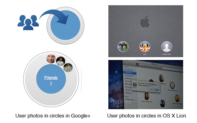
Have you noticed how Apple and Google have been going round in circles recently? Both OS X Lion and Google’s new Facebook challenger, Google+, sport circular frames around their user photos.
Admittedly it’s a minor detail, but it is interesting all the same. After all, it’s hardly an obvious thing to do. I can’t think of any system I’ve seen before that frames user photos in circles, and yet suddenly, two industry giants are releasing systems that do just that, within a space of a month of each other.
The connection between Google+ and OS X Lion goes further, of course, because Google has famously recruited Andy Hertzfeld, primary software architect of the original Macintosh, to design Google+. But Hertzfeld left Apple almost three decades ago, so clearly he didn’t take the secrets of the circle with him.
The circle motif makes sense in the context of Google+, where the metaphor is extended with the concept of a circle of friends. Equally, in Lion, AirDrop presents its circular user photos in a larger circle, similar to Google’s circle of friends, to illustrate other Macs available around your location. (See pics above).
So who actually stole the circle motif from whom? Or was it just an idea whose time had come? (Like the idea of adding a plus symbol onto the end of your logo, perhaps… hello Nike+). One thing is certain. Framing user photos in circles is a craze that is about to tip. Give it a couple of months and circular photos may be as ubiquitous as those cute reflections under logos that Apple helped to popularize ten years ago.
What do you guys think? Have you seen these circles before – maybe I’m missing something? Let us know in the comments.
Update:
Some commenters have suggested I’m getting the significance of circles out of proportion.
Perhaps. But just to be clear, I’m not simply talking about circles. I’m talking about the way in which circles are being used. Both Apple and Google have adopted them as part of their graphic language, to denote user profile pictures. It’s similar to the way in which Apple adopted round corners around a text field to denote a search box (see top-right of Safari, iTunes and almost every Apple app). The significance is not the rounded corners themselves, but when and how they’re used.
This kind of graphic language is very important – it’s far more than a minor aesthetic choice. For example, consider road signs – a circular road sign has a very specific meaning, which is quite different to an octagon or a diamond road sign.
Yes, it’s a small detail, but it’s attention to this kind of small detail that Apple excels at. That’s why their user interface design is legendary.


